iGO.nl, a local news site redesigned
For iGO.nl, I created a completely revamped website. The website has become more modern, resembling an online magazine, and the presented information is easier to find.
iGO.nl is the portal for the Goeree-Overflakkee region, featuring news, entertainment tips, and a business directory. Therefore, the website is divided into the sections of news, recreation, and business. In practice, the recreation and business sections were visited too infrequently. This was also confirmed by website statistics. After a thorough analysis of these statistics, I concluded that there was too much separation, and incorrect target audiences were being addressed.
Based on my conclusions, I presented two designs for a new homepage to the stakeholders at iGO.nl. The first design was in a magazine format, featuring large photos and highlighted stories. The second design focused more on displaying as much news and information as possible. Feedback from the stakeholders revealed that both designs were appealing in certain aspects. Therefore, I combined them into a single design. The underlying pages were also based on this combined design.
Check out the website at http://igo.nl/
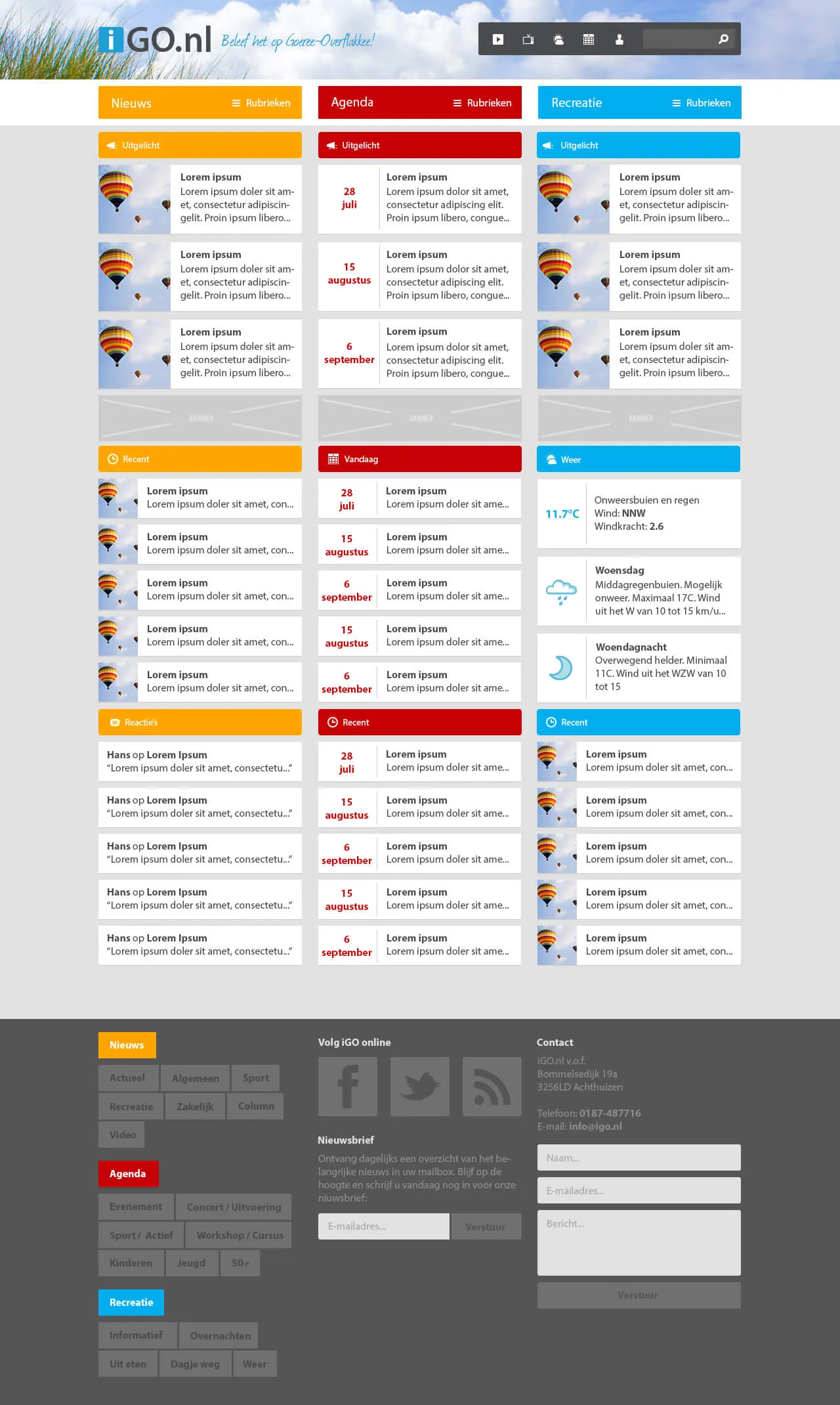 Version A presented sections in columns.
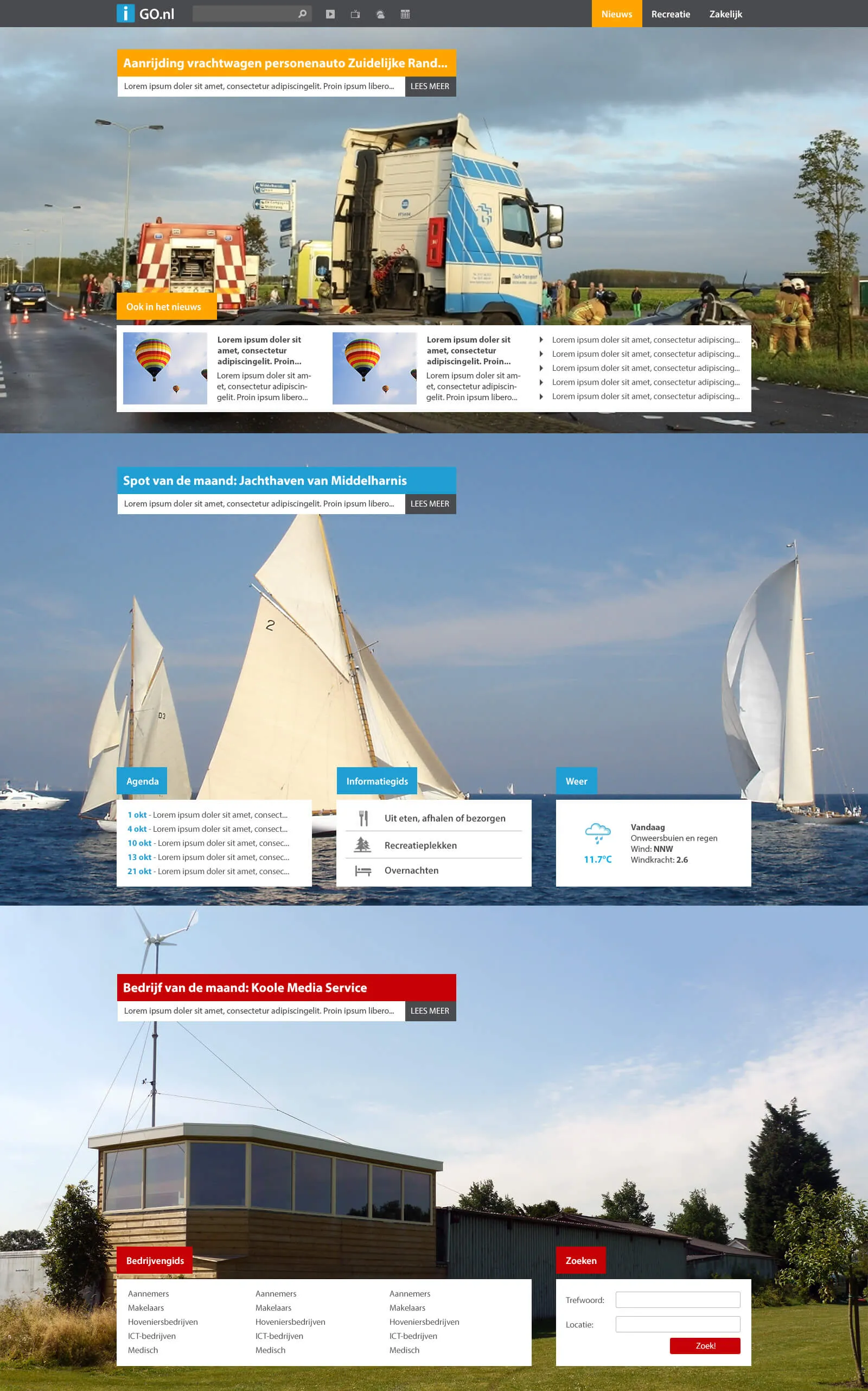 Version B prioritized large visuals.
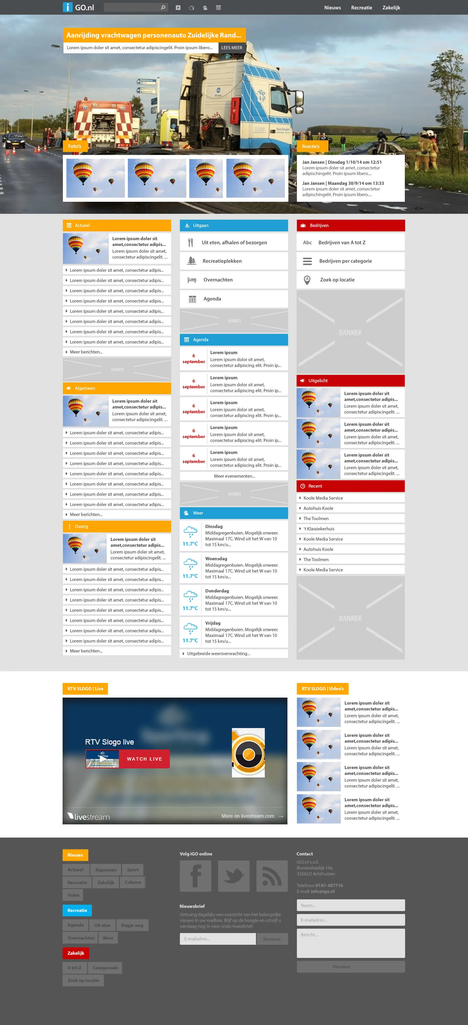 Version C combined the previous versions.
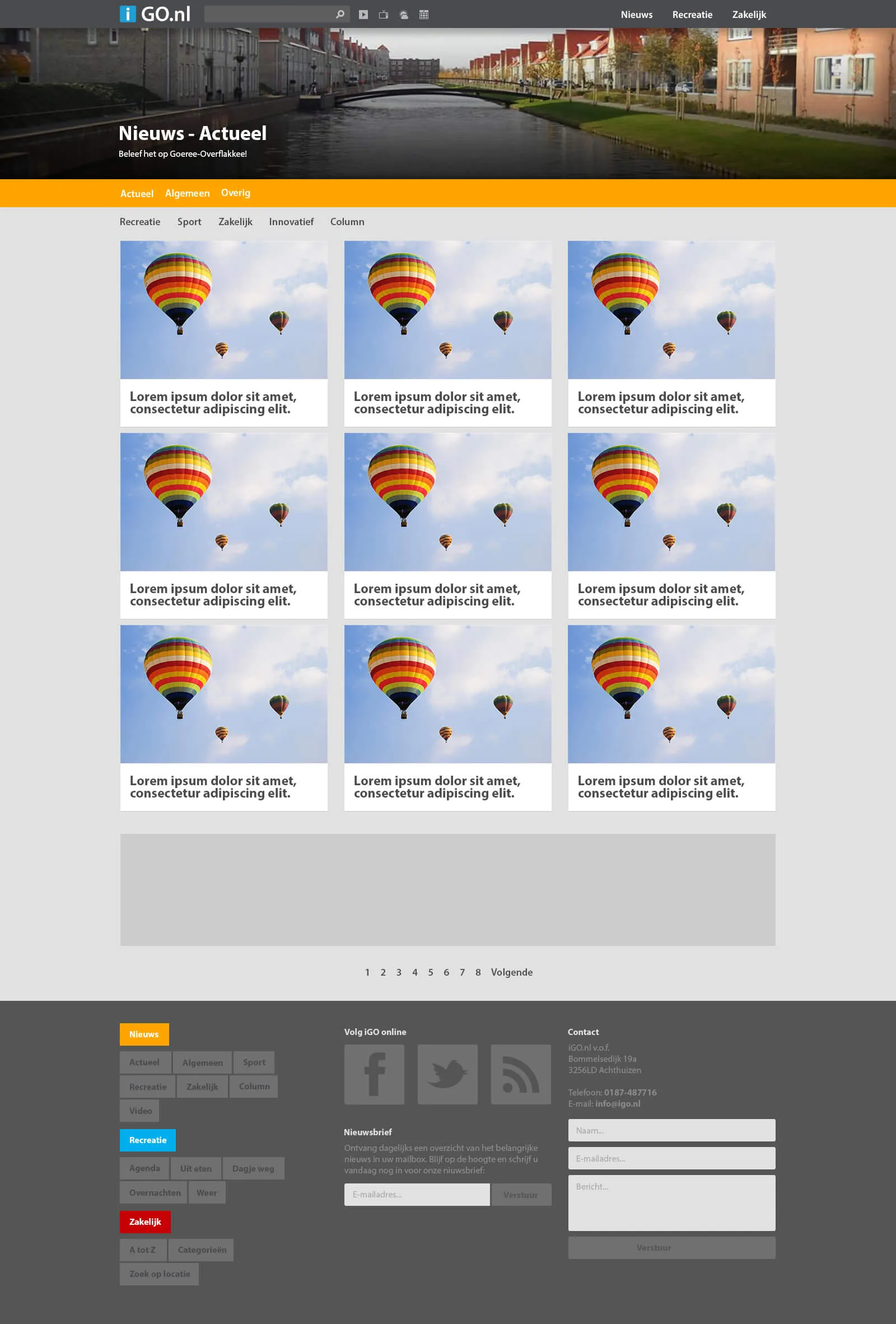 A news category overview.
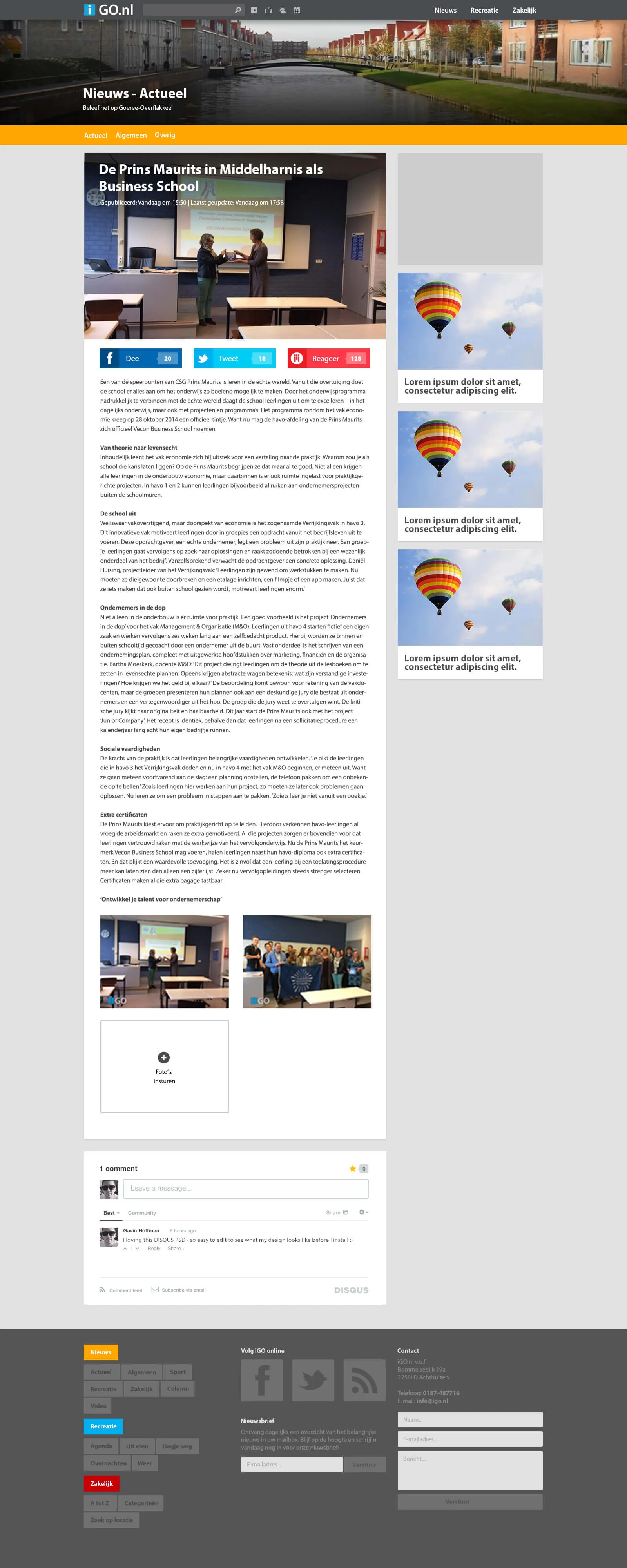 A news article page.
