Scheduling Market Research
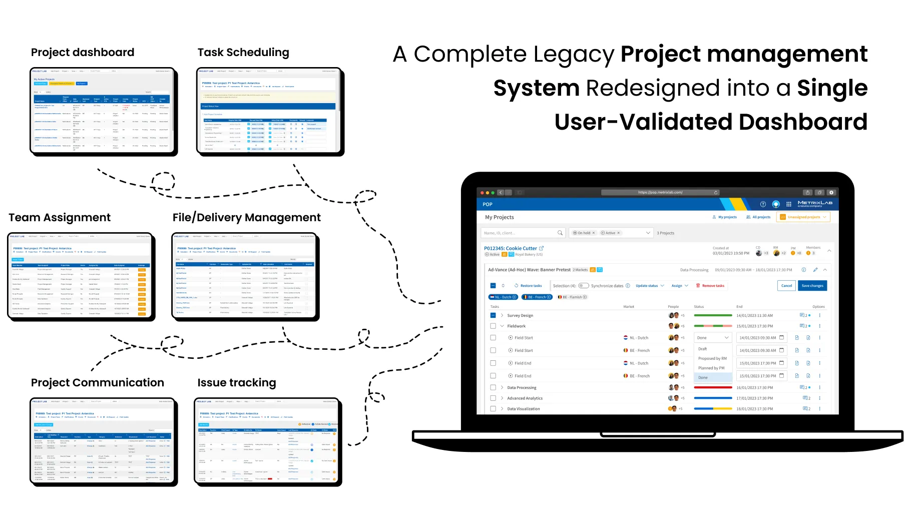
Problem statement – Project management had been scattered across a wide range of applications for research managers. Furthermore, managing larger projects across multiple research methods and countries required tracking different project instances in different browser tabs or manually updating Excel sheets. Finally, many irrelevant email notifications and unclarirty in project status caused users to ignore important project updates.
Project goal – Bring the full project management process in a single place, integrating the many applications in the full IT platform, and reduce the amount of irrelevant email notifications, while making project status more clear at any time. All this should communication between research managers, project managers, process managers and operational teams, resulting in better data quality and research insights.
Role – As a UX/UI designer, I was a member of the development team responsible for creating a new project management app. I created UI design, interactive prototyping, and conducted usability testing.
The Process
We could have just integrated a project management app like Monday.com or Clickup in the user journey. But we decided not to pursue that way because our research indicated that users wanted the full process in a single place. Using a separate project planning app would have required switching between different platforms, causing potential disruptions in the workflow. An integrated experience, where project management would be the backbone of the entire research journey could satisfy the user needs much better. As a bonus, the company would save a lot on licensing costs.
Redesigning the project management application meant that I had to update many screens into a new coherent experience. We began with a multi-page approach to give different types of users their own optimized experience. However, during usability testing I found out that a single overview better fitted the user needs much better. The final design featuring a single dashboard performed much better in usability tests, especially in giving clear insight into project status, and was approved for implementation.
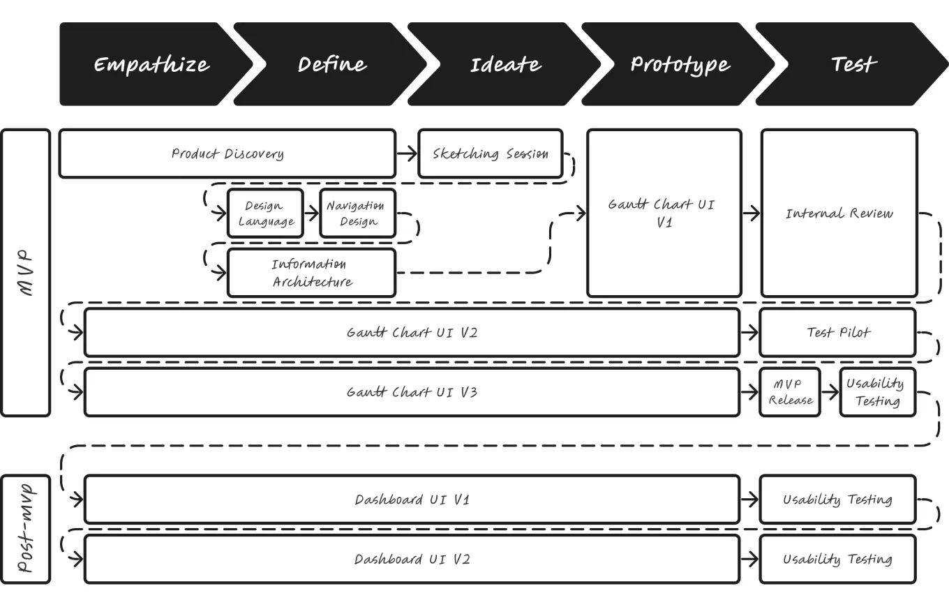
Product Discovery
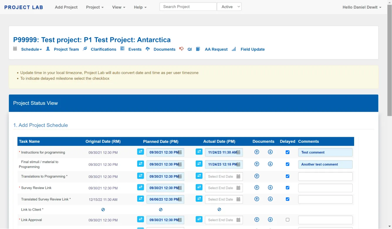
Before a development team was formed, I went through a discovery phase with the product owner. We started with an audit of the existing software, and quickly realized that it needed a complete redesign, in addition to rewriting the code-stack. The product owner called the software an “elevated Excel-sheet” after seeing it in a demo. Feedback from focus groups that I hosted indicated that users wanted to see less repetitive steps, input information into one place and receive less irrelevant notifications. We also observed that schedules for a single project were scattered across multiple pages, and users needed to keep multiple browser tabs open or even copy data into Excel manually for comparison. Each time a big project was delayed, it was a very tedious and time-consuming task to update all subsequent tasks across schedules.
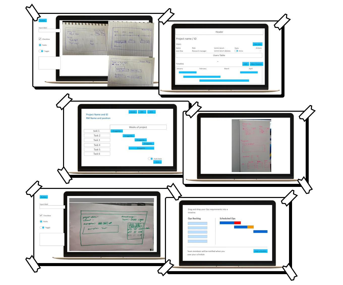
Sketching Session
To come up with new innovative ideas, I facilitated a sketching session with our team members. Although the team was multi-disciplined, consisting of designers, developers and product management, a Gantt chart design came up particularly often. It was a strong indicator that this would be a direction that would be well-supported by the team. A Gantt chart would also provide an easy way to drag items across time and update multiple items at once with dependencies added.
Design Language & User Navigation
In addition to the project management application other applications were being redesigned as well. We needed a design system that would be consistent across applications and consistent with the company brand. I explored a design language, navigation patterns, and I set up a design system. I also added vibrant and bright colors to the design, as the legacy applications were often referred to as “fifty shades of grey”.
For the navigation I explored more unconventional ideas resembling a Kanban board, with columns showing the status of a project and giving quick entry to other applications relevant to the project. On the other hand I also explored more conventional patterns with navigation on the left or top to move across applications and functionality. In the end we chose the conventional horizontal navigation because it would provide familiarity with the pattern of most legacy applications and it could be applied more consistently across applications.
Information Architecture
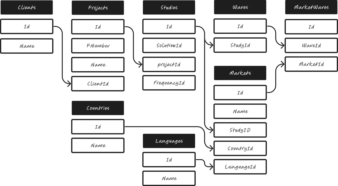
In the legacy applications the word project was used in conflicting ways. A project was both a overarching unit in accounting and a single unit within a larger body of work. With the development team and product owner I came up with the word marketwave for project units and a structure to identify information in the project more easily.
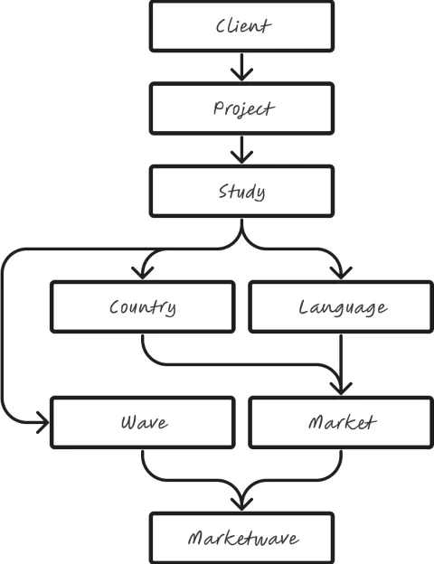
In the legacy applications the word project was used in conflicting ways. A project was both a overarching unit in accounting and a single unit within a larger body of work. With the development team and product owner I came up with the word marketwave for project units and a structure to identify information in the project more easily.
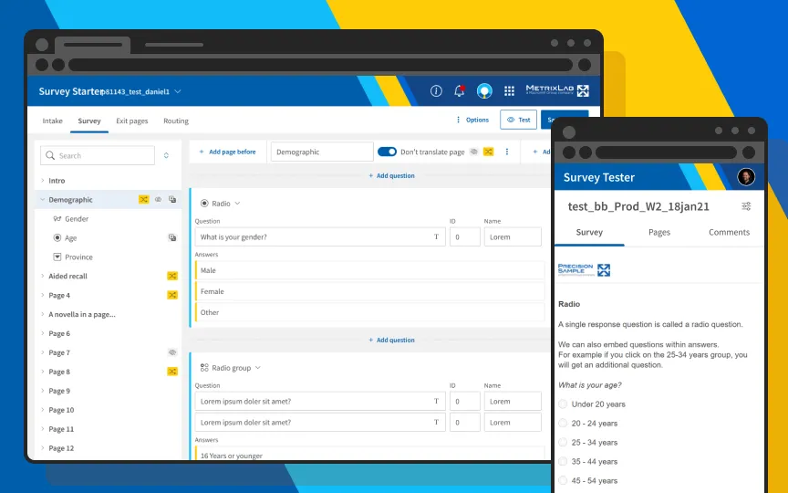
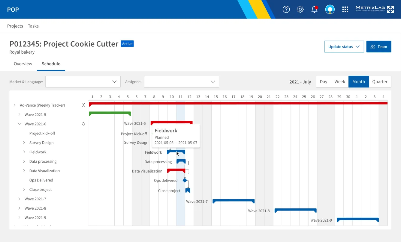
For our MVP, it was decided that the new application would consist of a project list, an overview of marketwaves within each project, and a Gantt chart for editing the schedule. The schedule in the legacy product would be disabled and link to the new product, so users would only be able to edit in one place.
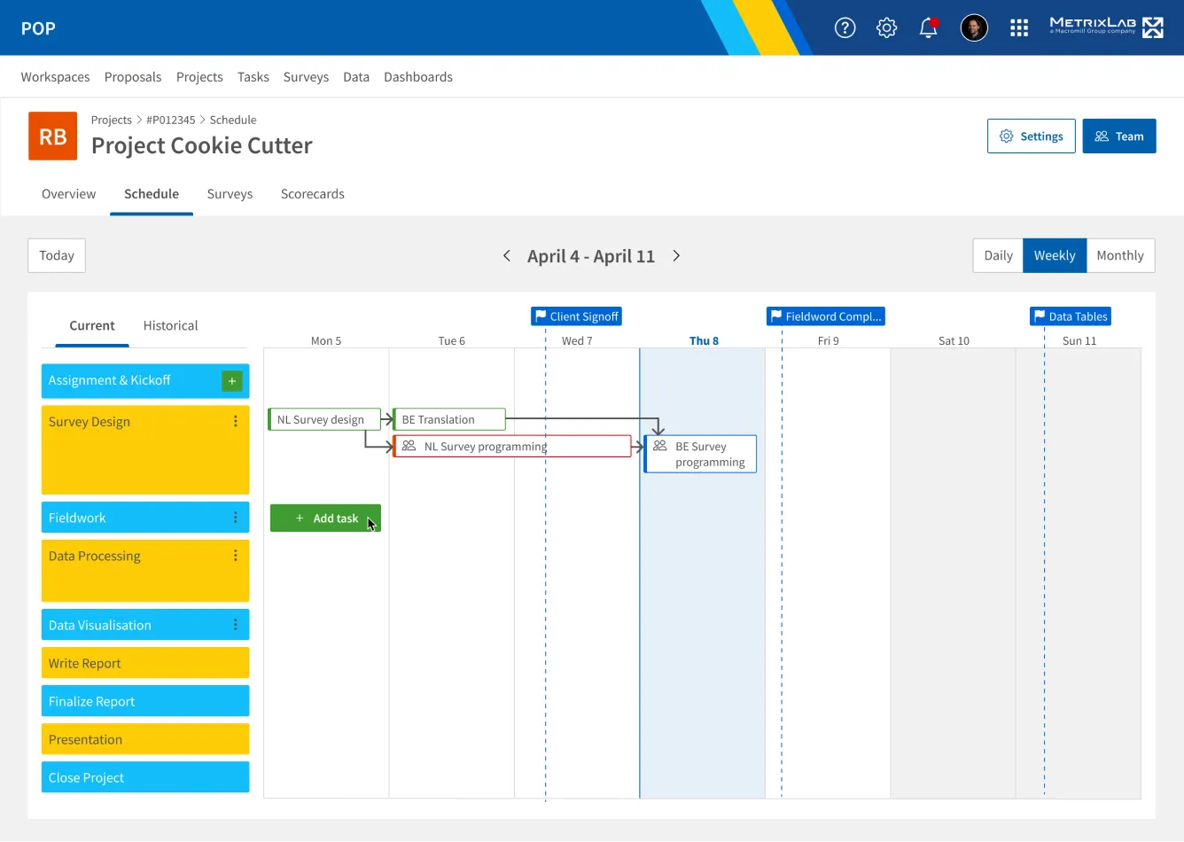
For the Gantt chart I initially explored a design in Figma following stakeholder requirements with the ability to add custom tasks to project phases, see milestones, and view task status. I used brand colors for the phases and communicative colors for task status. Green tasks are done, blue tasks are to be done while red tasks are overdue.
After reviews with stakeholders we were able to refine the scope and decide that we could eliminate the ability to add custom tasks and milestones for now. With the development team we picked a third-party Gantt UI component to speed up development work. I updated the design with pre-defined tasks and the design constraints of the third-party component.
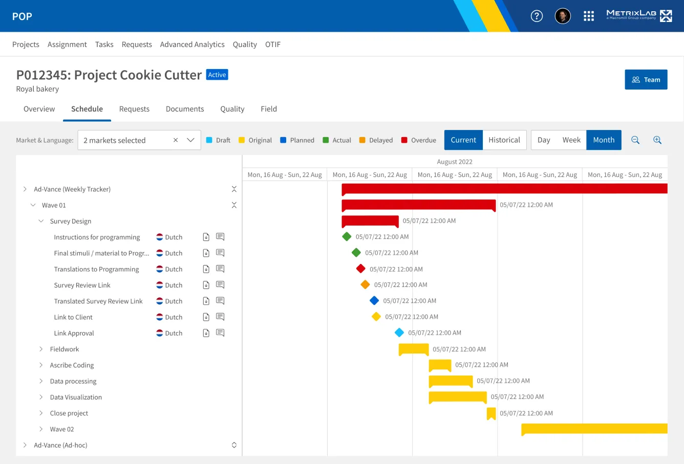
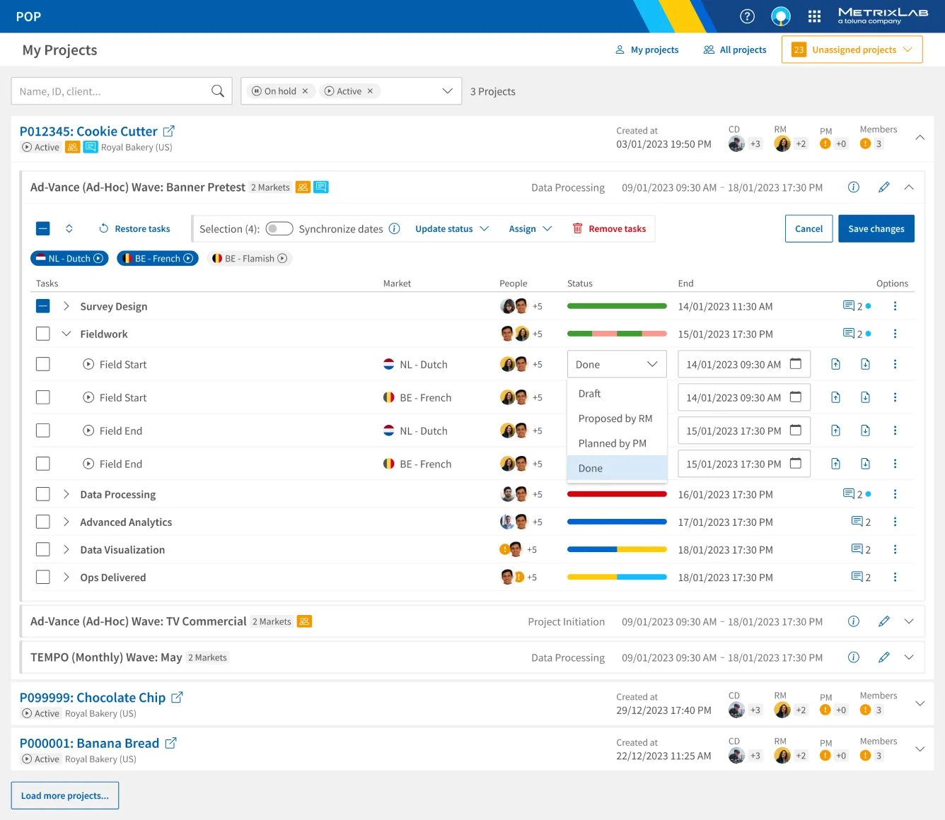
The design was updated a few more times before launch based on insights gained during development and through user feedback from a test pilot. I added a chart legend, created better control for the zoom level and removed redundant filters. Some features like adding files and comments were also added, and the task statuses were extended. Tasks could now be in draft state (cyan), original state (yellow), or delayed state (orange) as well. This was more in alignment with the legacy application statuses for tasks.
MVP Launch
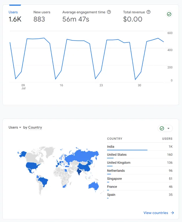
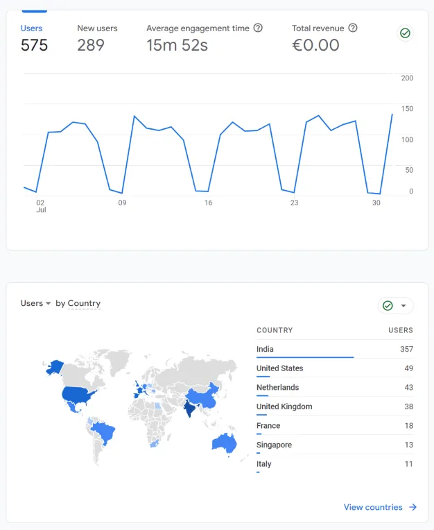
The product was launched as an MVP, after which we fixed bugs and collected more feedback. I collected data from Google Analytics and found that the MVP was used 600 users, versus 1600 users of the legacy product in the same time period. This meant that our main target audience for the MVP had instantly adopted the new scheduling features, and only users in supportive roles were still using the legacy application for functionality outside of the scope of our MVP.
Legacy App
MVP App
During usability testing and through other ways of getting feedback we found that not everyone liked the Gantt chart design though. Project Managers complained about having to click open tasks to update them, while Research Managers were confused by the many statuses. This was remarkable, since we did not add any new statuses, we only made the existing ones more visible with color coding. After getting this feedback we decided to experiment with a table view in which tasks could be edited inline, users would have more efficient controls and new features in addition to our MVP.
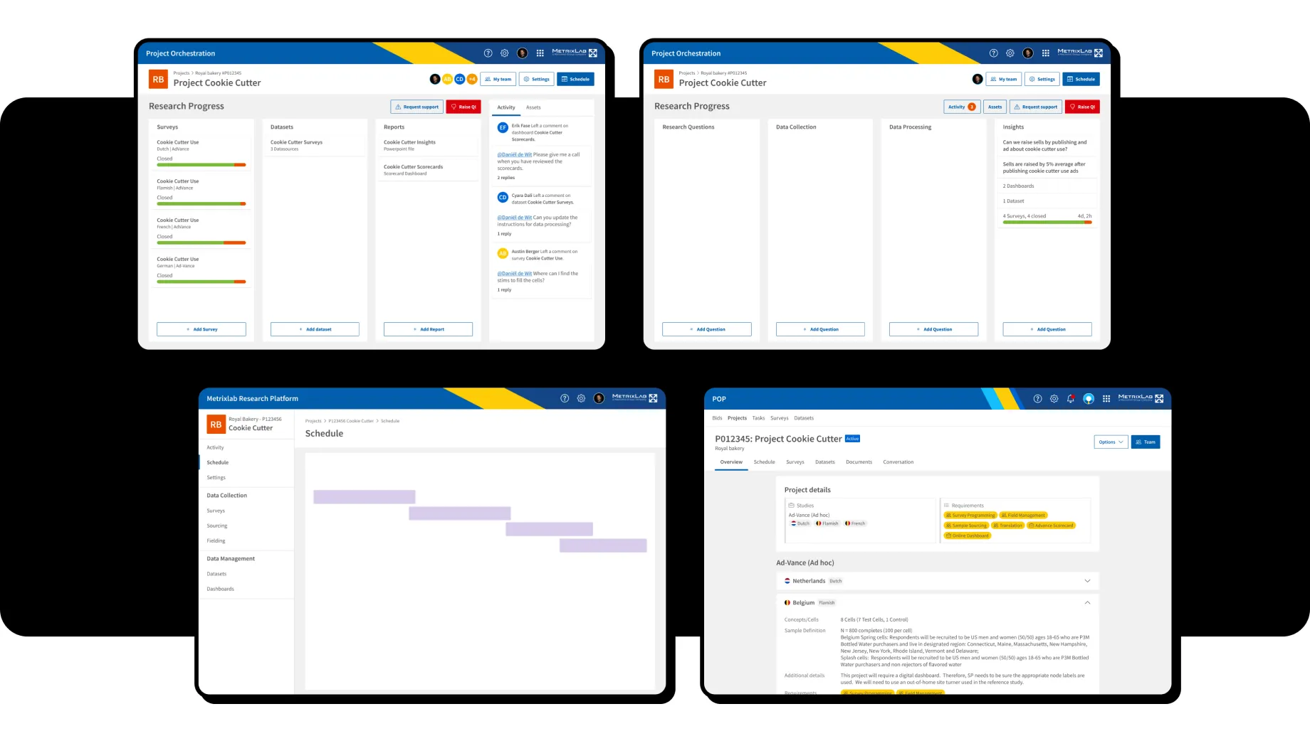
Dashboard Design
I recognized the need to refine our approach to enhance the platform's functionality when I talked to a stakeholder about assignment. I had always thought the flow of assigning based on roles in the legacy software should be kept intact at least temporarily, even though some users wanted to assign based on tasks. But now the stakeholder was okay with that as well, and the road was free to make more rigorous changes.
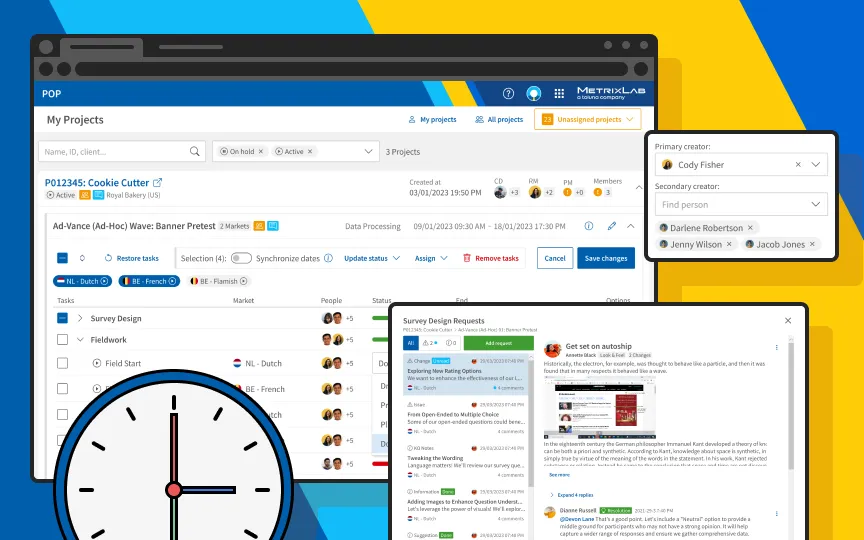
I decided to consolidate all essential information into a single, intuitive dashboard, not just for assignment and tasks but also for communication and files. Beginning with the projects list, I transformed each project into an expandable section, offering a clear view of active marketwaves. Within each marketwave, I introduced a horizontal timeline layout for phases, doubling as interactive tabs to navigate associated tasks seamlessly. In edit mode, the interface transitioned into a user-friendly vertical tree list, facilitating the selection of tasks across multiple phases and enabling the convenient synchronization of dates.
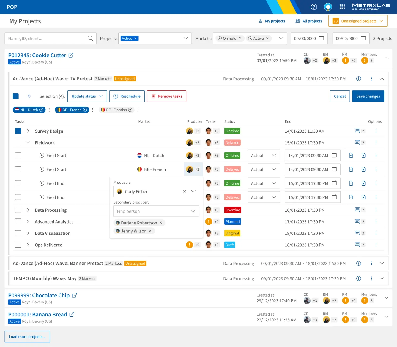 In edit mode, users can drill down into projects until they see the specific tasks. For each task, they can assign other users, update status and date, and manage files.
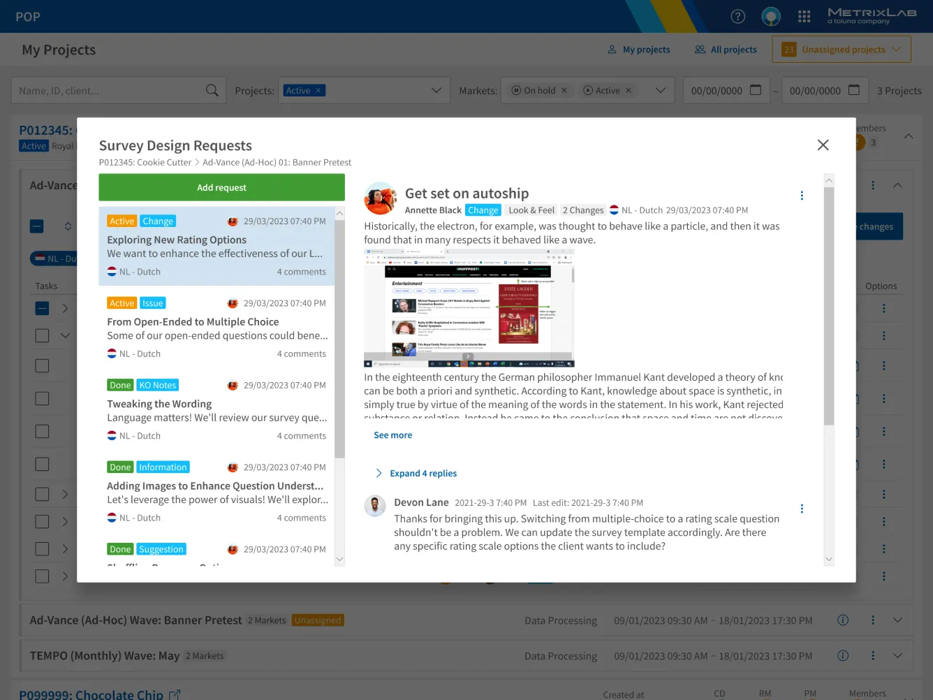 For each phase in a marketwave, requests for e.g. resolving issues or clarifications can be added. Each request has a comment thread so users can efficiently communicate with each other.
During usability testing of the revamped design, an intriguing insight emerged concerning users' perception of task statuses, linked to the earlier feedback of having too many statuses. Surprisingly, a segment of users had previously overlooked task statuses until the introduction of color-coded indicators in the MVP. The red and orange hues, intended to draw attention to issues, inadvertently induced a sense of urgency and anxiety among some users. Following careful consideration, I made the decision to retain the color scheme for its efficacy in prompting users to address unresolved issues. However, a crucial refinement was introduced in the accompanying text to alleviate user anxiety by clearly defining responsibilities for delays. This adjusted design not only resonated positively in testing but also provided users with better insights into project statuses, successfully striking a balance between urgency and transparency.
In light of the team's Agile Scrum way of working, I strategically narrowed down the design scope to prioritize the most impactful improvement: the introduction of the assignment feature. To speed up development and ensure a smooth transition, I crafted a static Angular template, offering developers a ready-made foundation to incorporate the new assignment feature seamlessly. This scoping-down strategy not only aligned with user priorities but also facilitated a swift and focused development phase, marking a pivotal step towards enhancing the overall functionality of the POP app.