Building and Testing Surveys
In response to the limitations posed by a desktop-based survey editor, our team undertook the task of developing a cloud-based replacement.
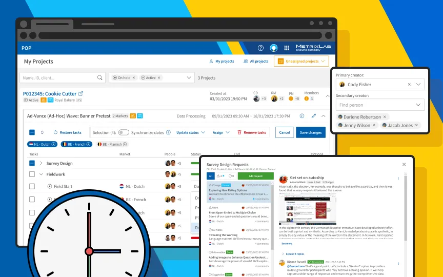
Problem statement – The previous system required surveys to be downloaded and uploaded from a server, causing many inefficiencies. The poor usability of the tool limited accessibility to trained and cheaper employees. Additionally, the absence of a dedicated testing tool compelled researchers to utilize live survey links or duplicated surveys for testing, leading to complications in result interpretation and server costs.
Project goal – Our solution to survey programming not only aimed to streamline the survey creation process in a cloud-based online tool, but also democratize survey design and testing for research managers so they could rely less on operational teams for simple template adjustments.
Role – As a lead UX/UI designer I supported a designer inside the development team working on the survey builder. Alongside, I was solely responsible for the design of the survey tester, creating prototyping and instructing developers.
Designing the survey tester
The design process for the survey tester was quick and straightforward, due to well-defined requirements and a seamless collaboration between me as a designer and the development team. Armed with a clear vision, the initial phase involved crafting detailed prototypes and screens using Figma. This clarity extended to the implementation phase, where developers found the transition from design to execution to be smooth and straightforward.
 The design for the survey tester was straightforward and consistent with the design system.
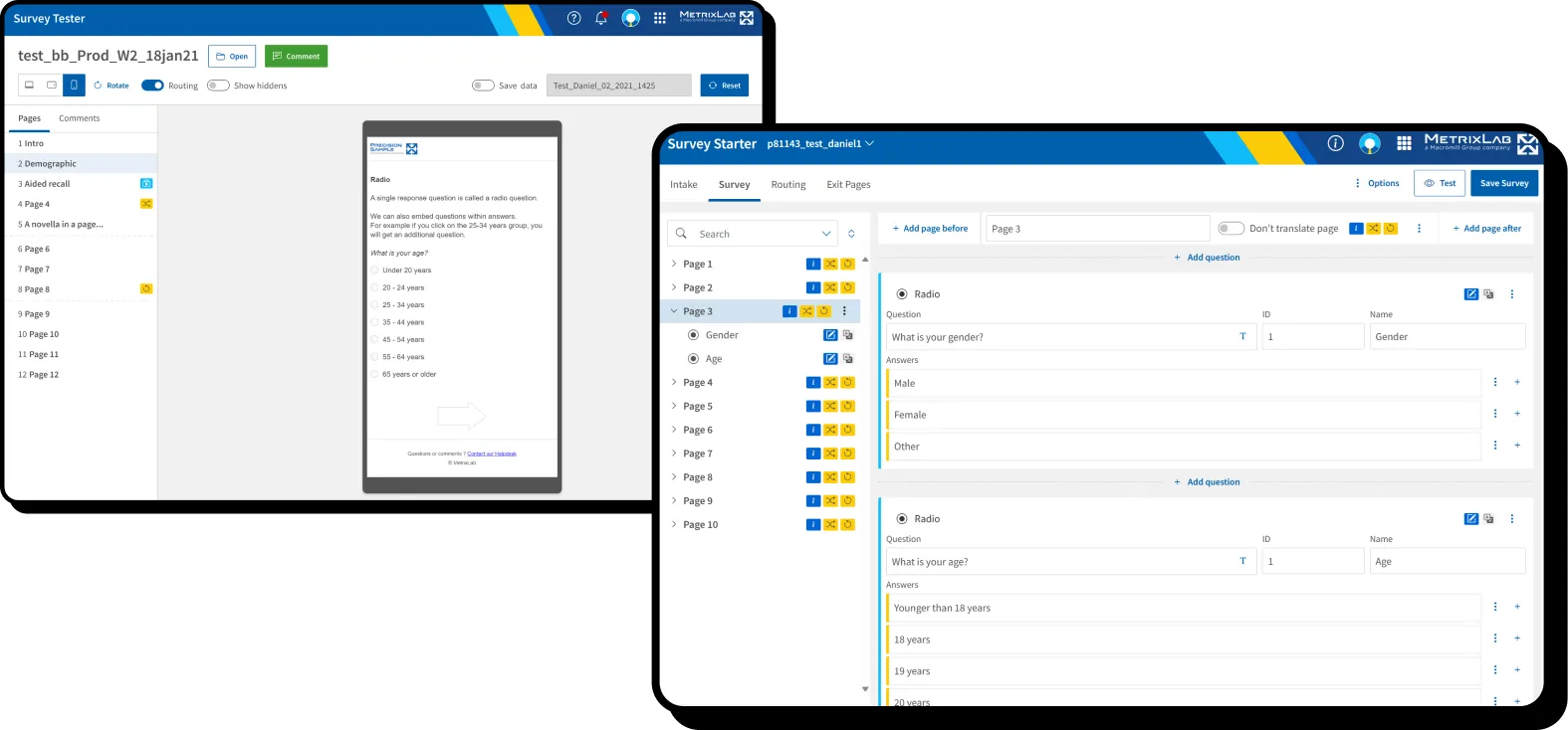
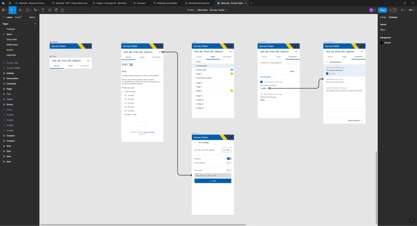
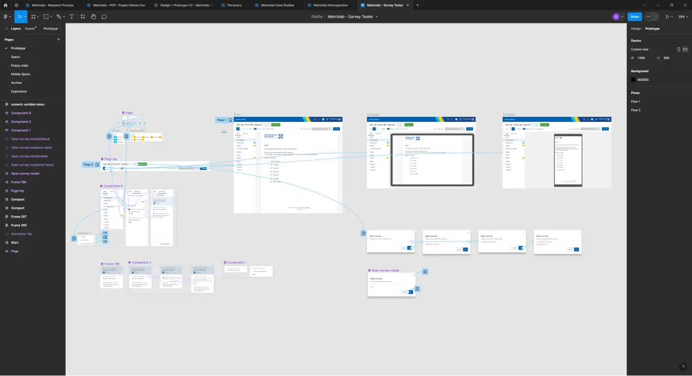 I created a prototype in Figma for the developers to click through and understand the flow.
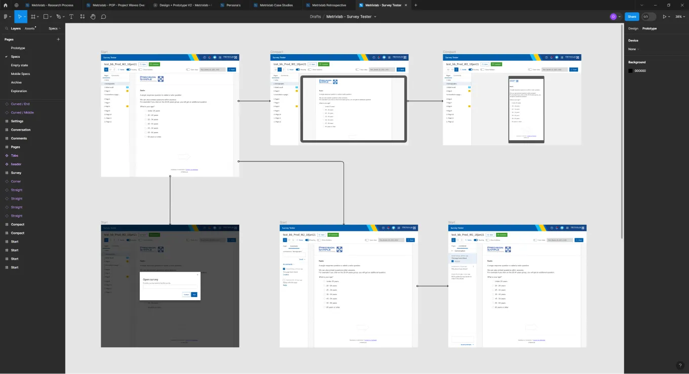 In addition to the prototype I laid out each screen in a visual flow, for the developers to inspect.
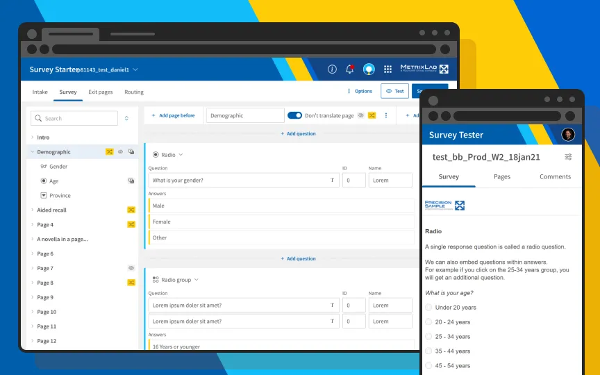
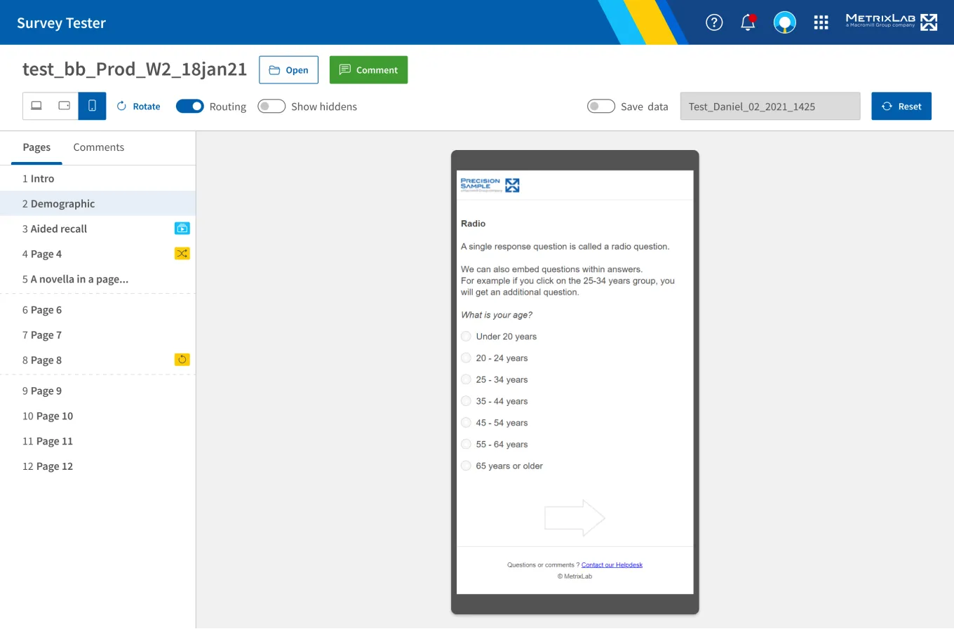
 For responsive design I also added screens for mobile, so the surveys could be tested on actual devices.
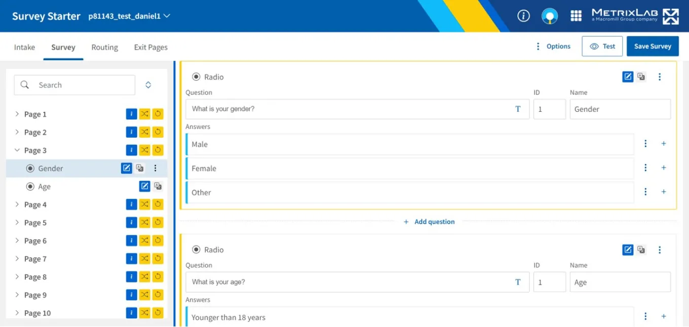
Optimizing the survey builder design for data density
The challenge for the survey editor was to design a more intuitive experience, that could be used by researchers without them having to read an extensive manual. I contributed to the design phase by hosting a sketching session with the development team. After the session another designer in my team created detailed mock-ups for handover. The mock-ups were originally designed for a 1440px by 1024px viewport size, without regarding the laptop screens of 1366px 768px that are generally used within the organization. This created problems in a later phase of the project. Below is the original mock-up width 1440px width.
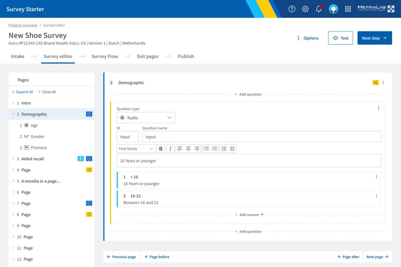 The original design created by the designer in my team used wide spacing for a calm and clear appeal.
Outcome of the first iteration
Following the mock-ups, the developers created the application using web technology. You can see the result below on a viewport of 1366px by 650px, as regularly used by researchers and survey programmers in the organization. During the training sessions with researchers, the size of the layout was brought up by them as an issue. The team recommended that when working on a small screen, the users could zoom out to see more of the application. However, when survey programmers had to do a pilot later, they pushed back on this because they were not able to work efficiently that way.
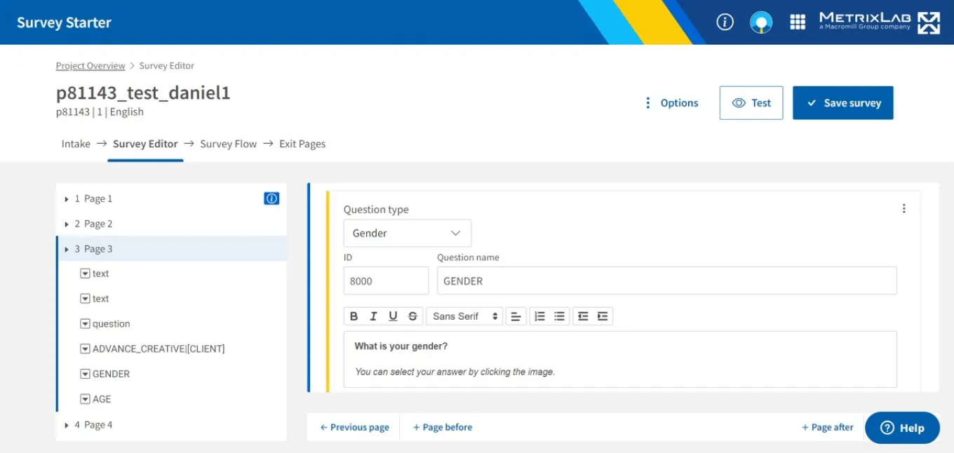 The implementation by developers on a 1366px by 650px viewport shows less information.
 An even smaller viewport shows that the editor was not optimized for smaller screen sizes.
New design & approach
This time, instead of taking the design straight to development, we took a different approach The original designer and me created new mock-ups, and after aligning on a more data-dense design, I also created a prototype in Angular using fake data and design system components. I presented the prototype in a review sessions with survey programmers where they were able to click through and provide direct feedback. The more detailed mock-up allowed the survey programmers to see what different pages & question types would look like, giving them a more realistic idea of what the final product would be.
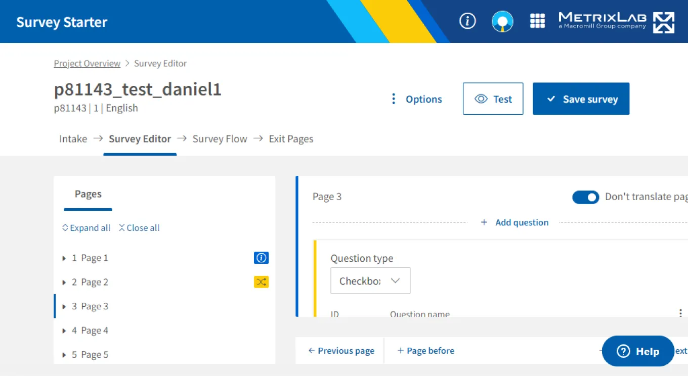
The survey programmers liked the improvements, but they also came up with new ideas. As you can see below, when scrolling down in the editor, there was still a considerate amount of space needed to show a question and its answers. The survey programmers told us that the actual question and answer text mattered most to them, and they would like each to be on just one line along with the labels and id’s in the interface.
 The optimized Angular template by me shows more information on the most common viewport.
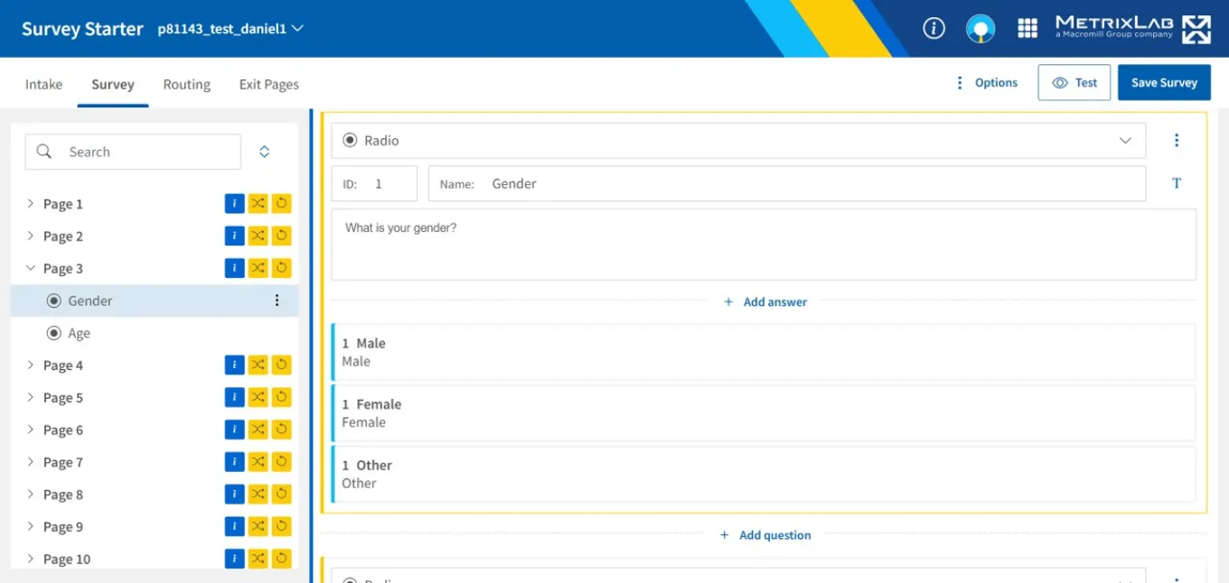
We applied this feedback in the mock-up and below you can see that the gender question now takes up much less space. The new design was implemented by the developers, who were able to follow the design much more closely because the design was provided to them in Angular code.
 With further optimizations the Angular template could even show multiple questions in the viewport.
Learning & Conclusion
In summary, we could not have gotten where we are now without user feedback.
- Improving the data density of the design really helped survey programmers and researchers to work more efficiently.
- It's important to listen to user feedback quickly and not advise users to deal with a non-optimal interface by themselves.
- And finally, using coded prototypes to get feedback from users can speed up the entire process & allow the developers more time to focus on the final approach only.
Bonus: Updating the survey design
As a bonus, I also got to work on the design of the surveys themselves. The product owner wanted to leverage our design system to save on maintenance efforts and costs. This required the surveys to be redesigned and the design system to be updated. For the surveys it was a blessing, because they looked outdated and where suffering from usability and accessibility problems. However, using the design system was challenging because it did not support customizing at first. Our surveys required customized themes to match client branding, which I validated with stakeholders before setting off. So while another designer focused on the visual design, I worked on making our design system customizable and creating responsive examples for handoff.
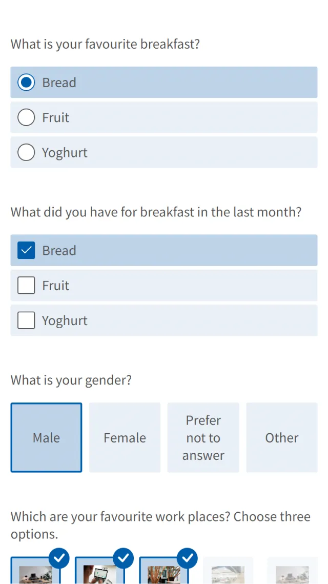
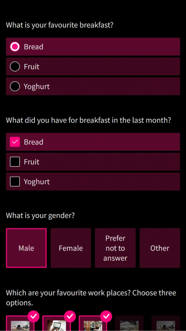
Examples of the new survey front-end on mobile with light and dark theme and two different brand colors.
To make our design system customizable, I updated the Angular components to use CSS variables. These variables could be updated through Javascript, which made it easy for developers to apply theme setting. I made sure that legacy settings where supported, and the approach of CSS variables was also scalable enough to support switching from light to dark mode in the future. Additionally I created tooling for automatically generating css variables of color swatches for default, hover, and active states for question options. And finally I added developer functionality to automatically choose a white or black text color depending on background color. This would make it easy for developers to have better color contrast in surveys for better accessibility, regardless of theme settings. I documented all of this in Storybook with fully-responsive examples for each question type for handover to the developers in the team.