Clear data in Groan dashboard
Groan is a supplier of raw materials for animal feed in Northwest Europe. Each day they are responsible for large quantities of materials that need to be moved. These quantities are registered in contracts with buyers, who call multiple times a day to know how much quantity is left of their contracts.
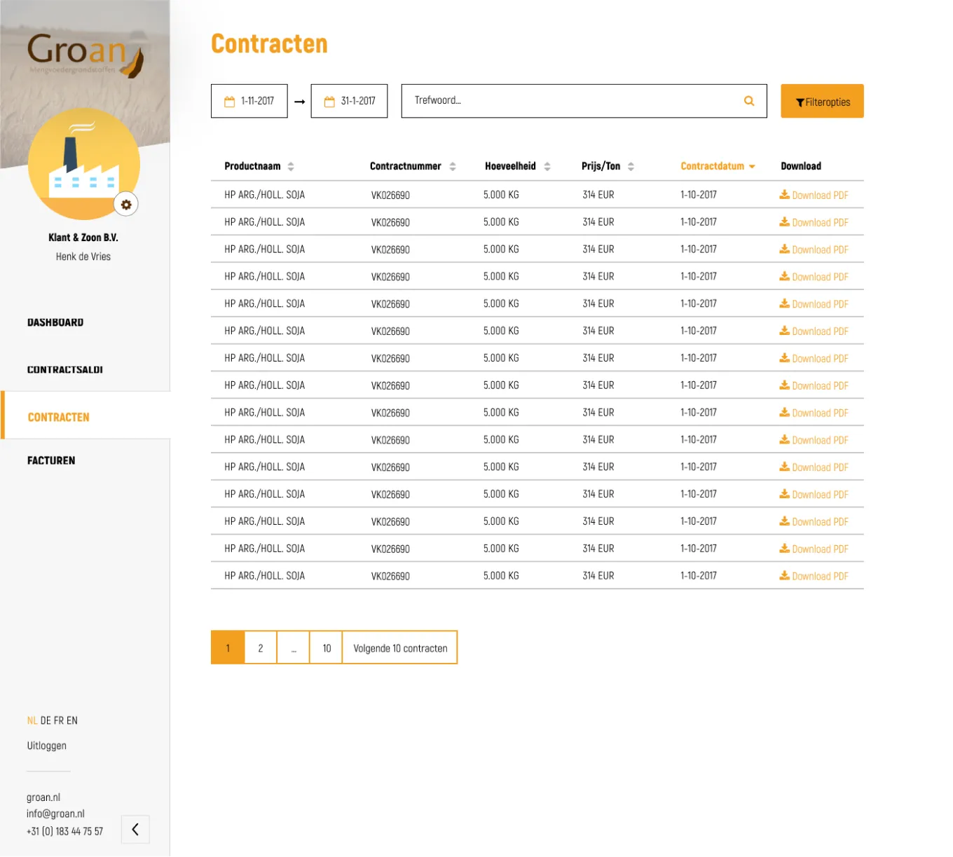
To reduce these calls and to give buyers more insight into their contracts, Groan ordered a dashboard at our organisation. I was responsible for designing this dashboard and handoff to our developers.
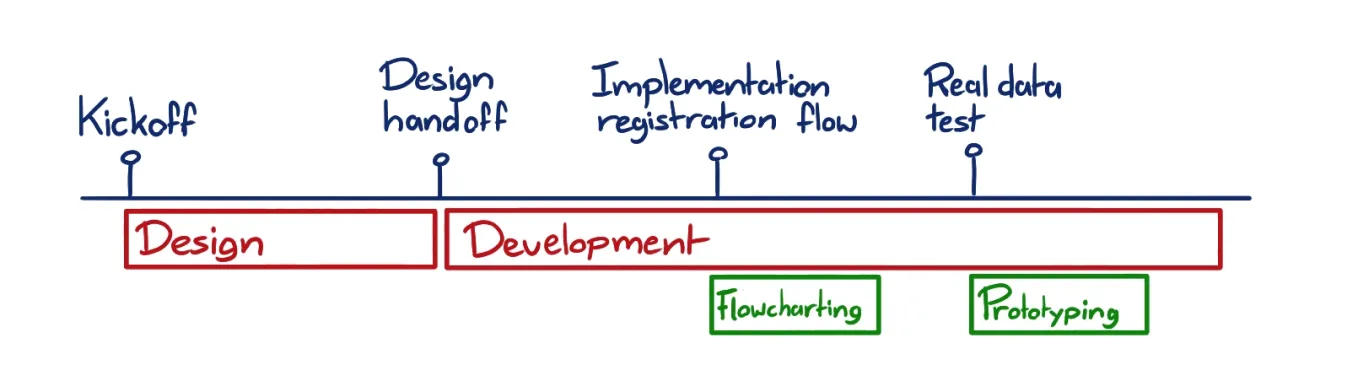
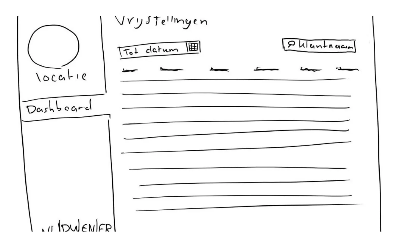
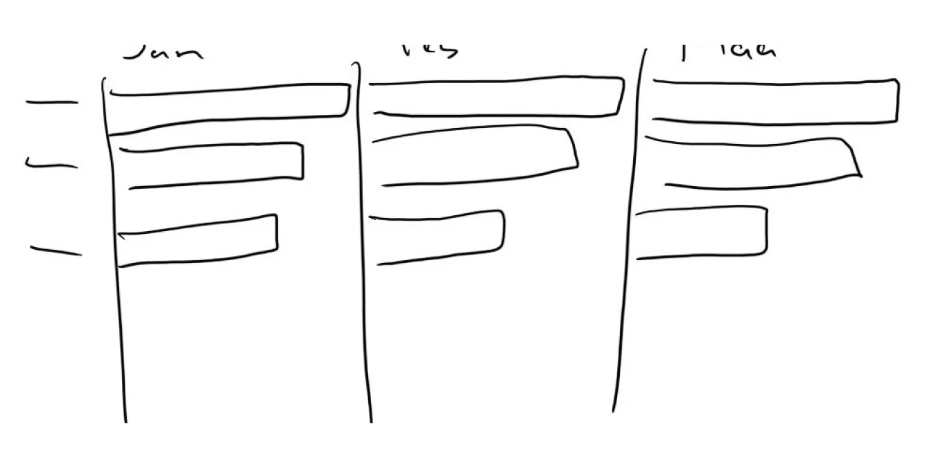
During our first meeting with the client, I sketched some wireframes based on their experiences and needs. After the meeting, I translated these wireframes into a visual design with different pages and data charts.
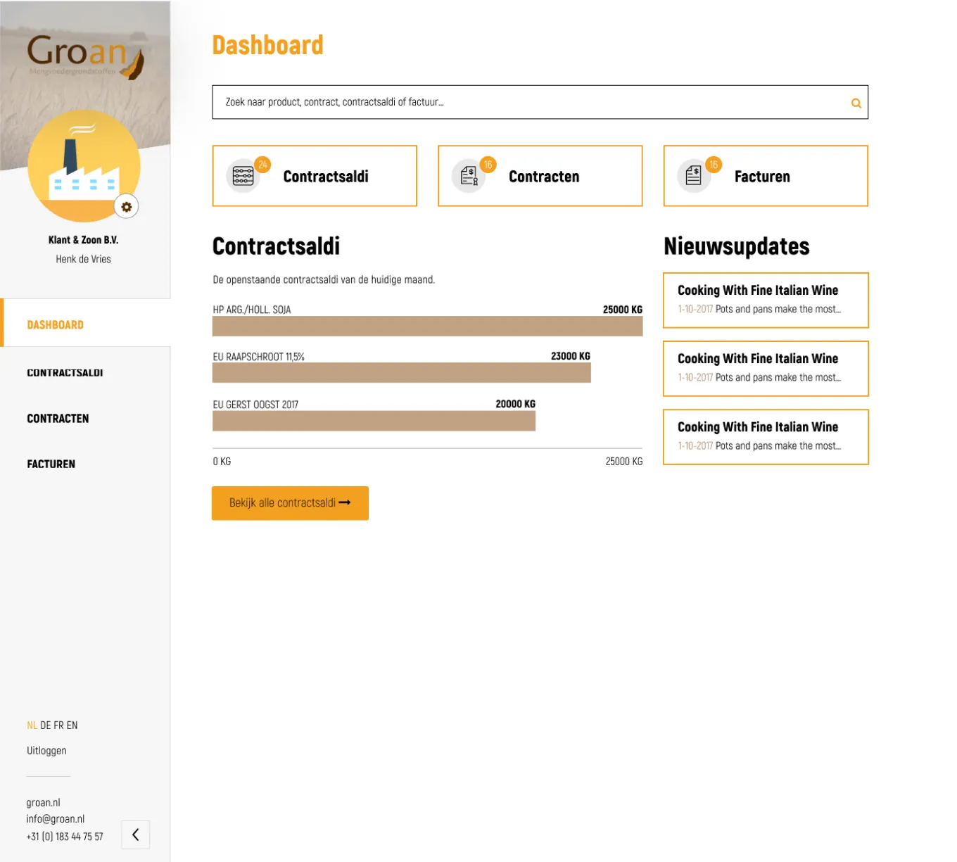
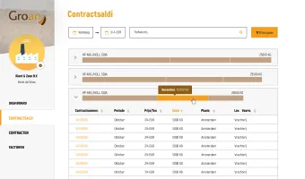
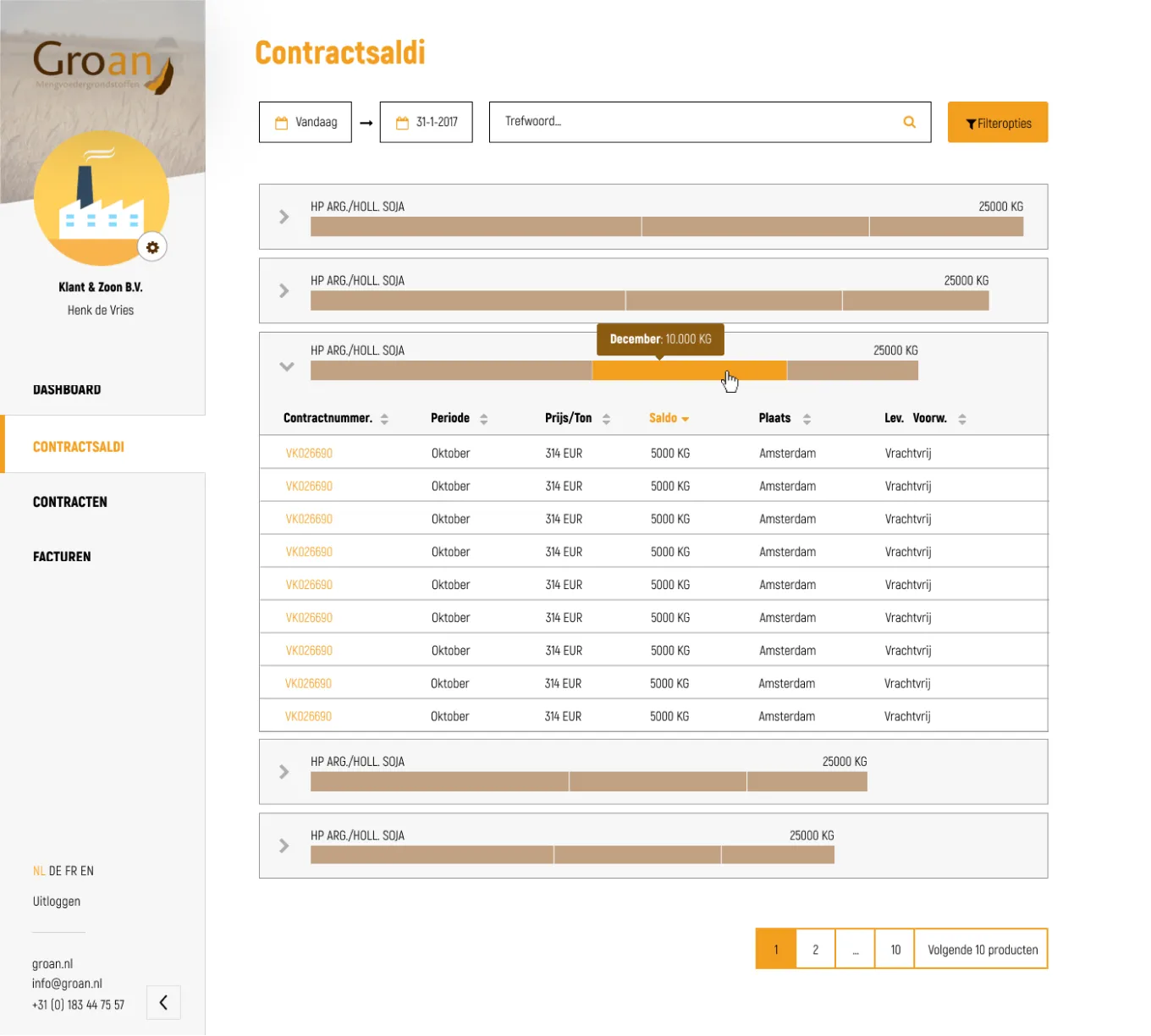
Especially challenging was designing a visualisation of the quantities of products in the contracts of users. This visualisation was changed multiple times after feedback session with our clients until everyone trusted that users would understand the quantities.
Prototyping the Math
Later on in the development process, it became clear that the quantities differed a lot between contracts. As a result, some bars in the chart became so small that they broke the user experience of the application. I proposed to the developers to smoothen the chart by giving each bar a minimal width, so the user experience could not break. The chart would be less realistic, but users could still spot differences between quantities in a visual way.
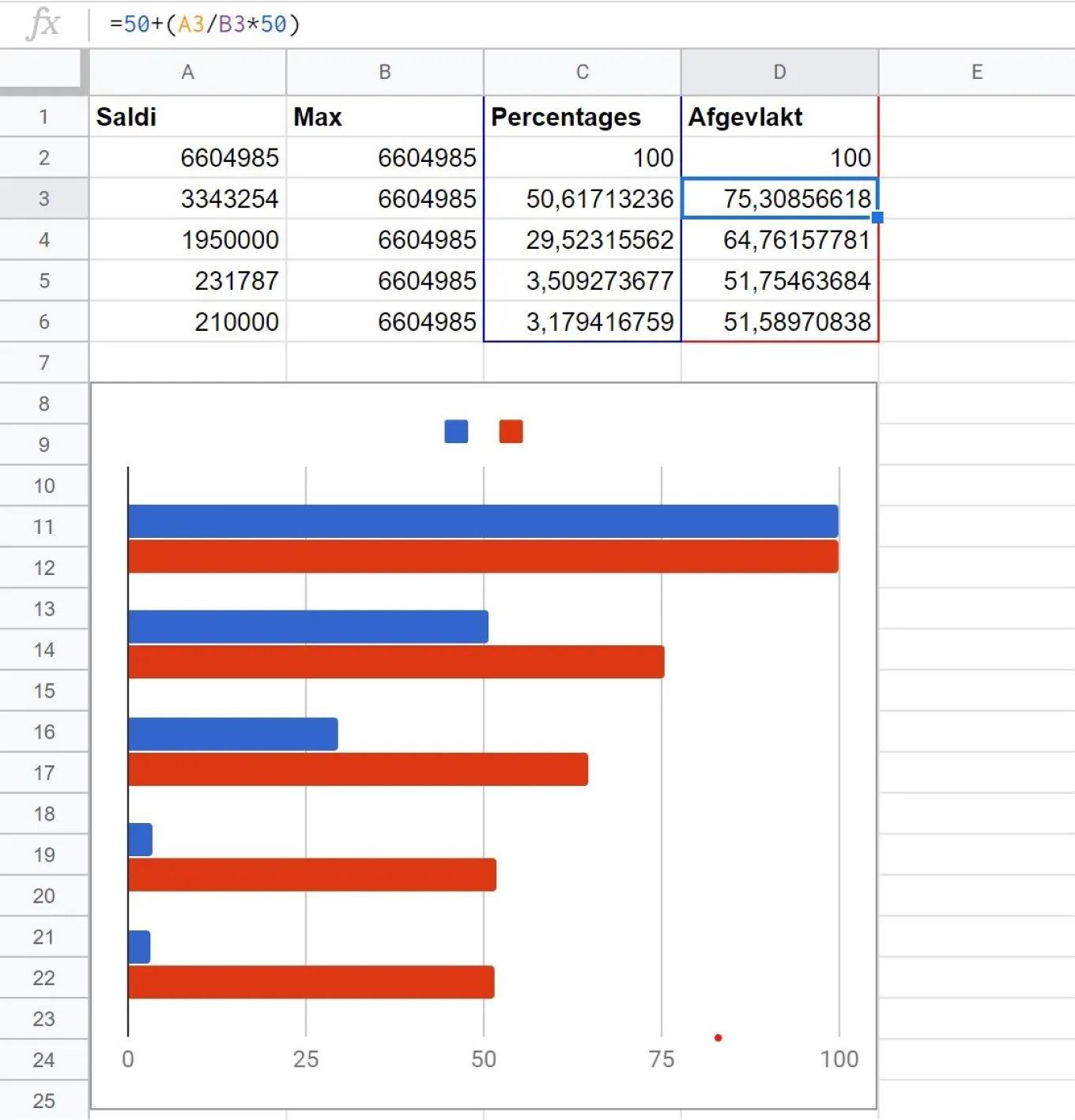
However, our developers were not able to come up with a calculation that would enable them to implement this solution. To make the solution more clear and aid our developers, I created a prototype in Google Sheets with my own calculation. After seeing the prototype, the developers were able to quickly copy this calculation and fix the application.
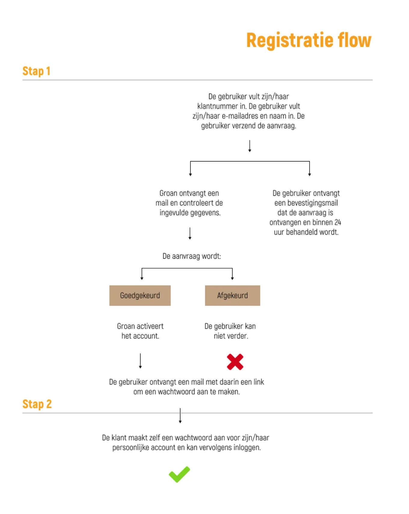
Explaining the Flow
During handoff, our developers had questions about the registration flow. I had designed three screens for this purpose, but it wasn't clear how information would be stored in the database and when e-mails would be send to users. To make this clear, I constructed a flowchart that documented each screen in steps and the actions that would be taken by the user, the client and the application.
After presenting this flowchart to our developers and our client, I had to revise the flowchart several times. Although the screens in the visual design were already approved by our client, they wanted to add several safety measures after seeing the flowchart. In the end, the flow was reduced to only two steps, while multiple data fields and an additional check by our client were added.