A design system for Wimood
Wimood, one of the largest suppliers of Wifi equipment in the Netherlands needed a new design for its website and webshop. Because of their large and extensive backend system, we would only supply them with a design, frontend templates and components. They would then apply those into their backend system themselves.
Previously, I had started building a design system of general templates and components for different kind of websites and applications in Figma. This case seemed a good way for us to test this desing system with a webshop. I would be working with another designer for one week in the same file in Figma in order to move things along quickly.
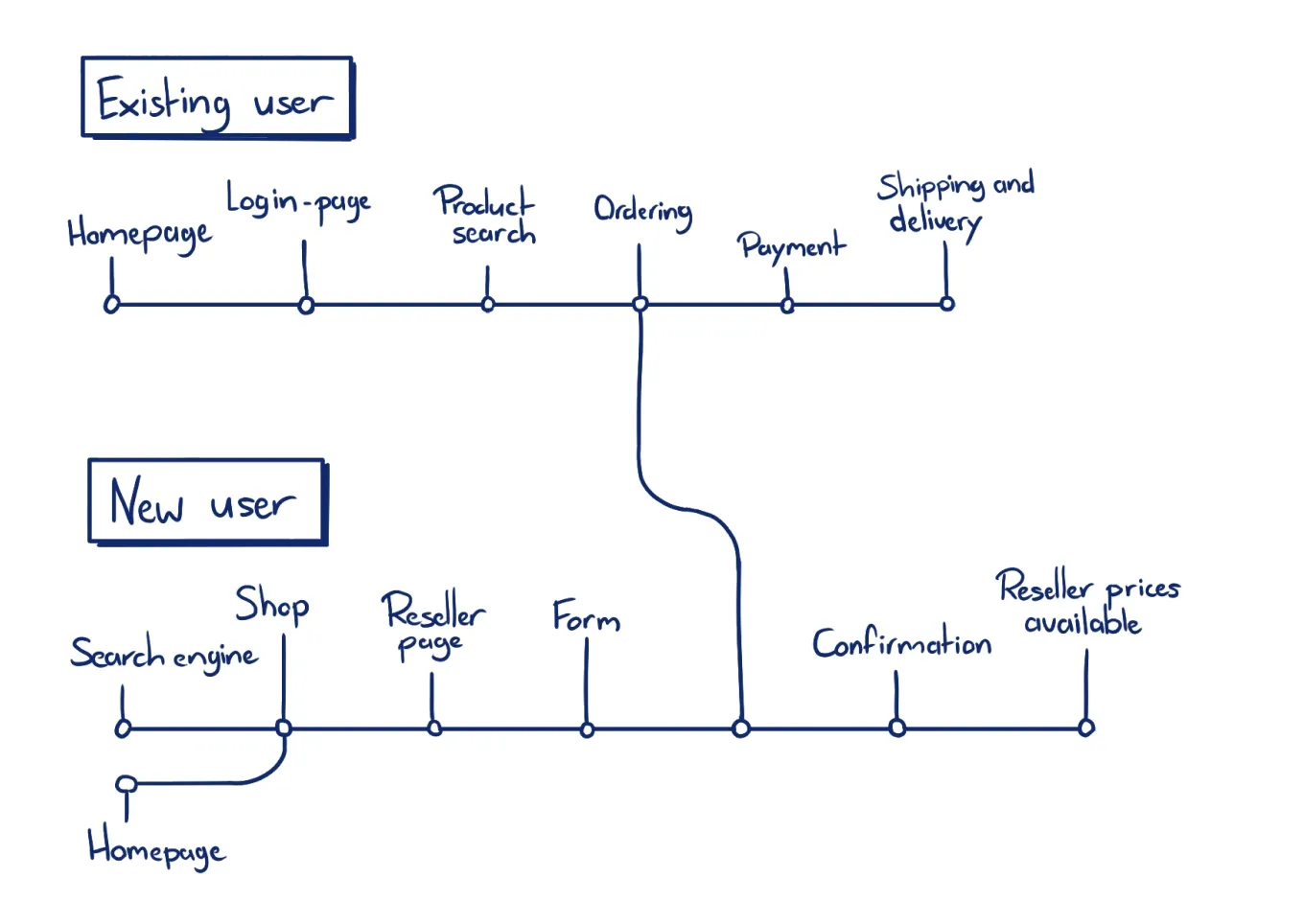
Customer journey and wireframes
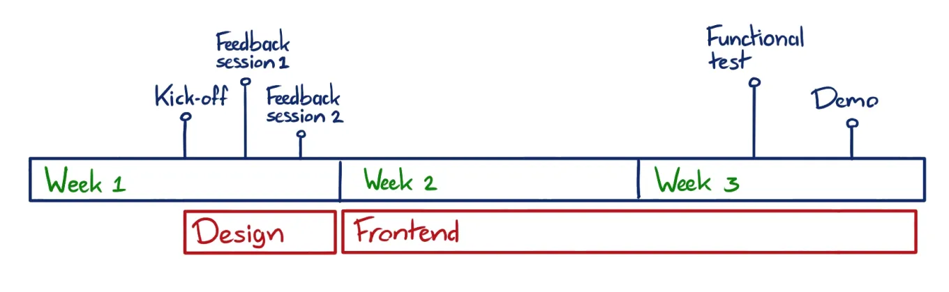
We started the design week on Wednesday with a session in which we made a journey map and wireframes. In the session there were two designers, a project manager, an external marketeer and the CEO of the client. At the end of the session we knew which pages were to be made and how they would fit into the flow of the user.
Because we already had existing templates and components the other designer and me were able to design a homepage, product pages, content pages and a checkout flow in just one day. Working in Figma while sitting next to each other also helped a lot in quickly setting up our styles, colors and fonts according to the pre-existing brand.
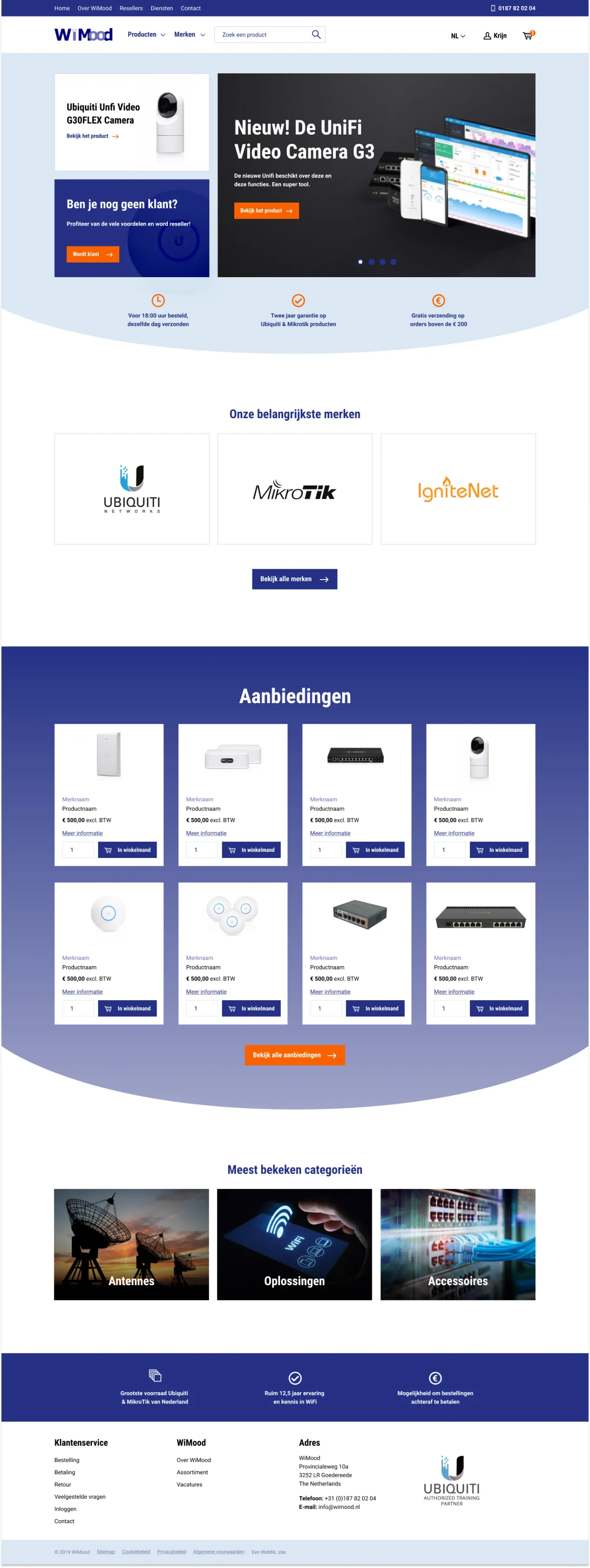
While the other designer worked on the design of the homepage, I designed the other pages following the same style during the first day.
The next two days I worked on presenting the designs, collecting feedback and improving the designs. On friday, the entire design was finished.
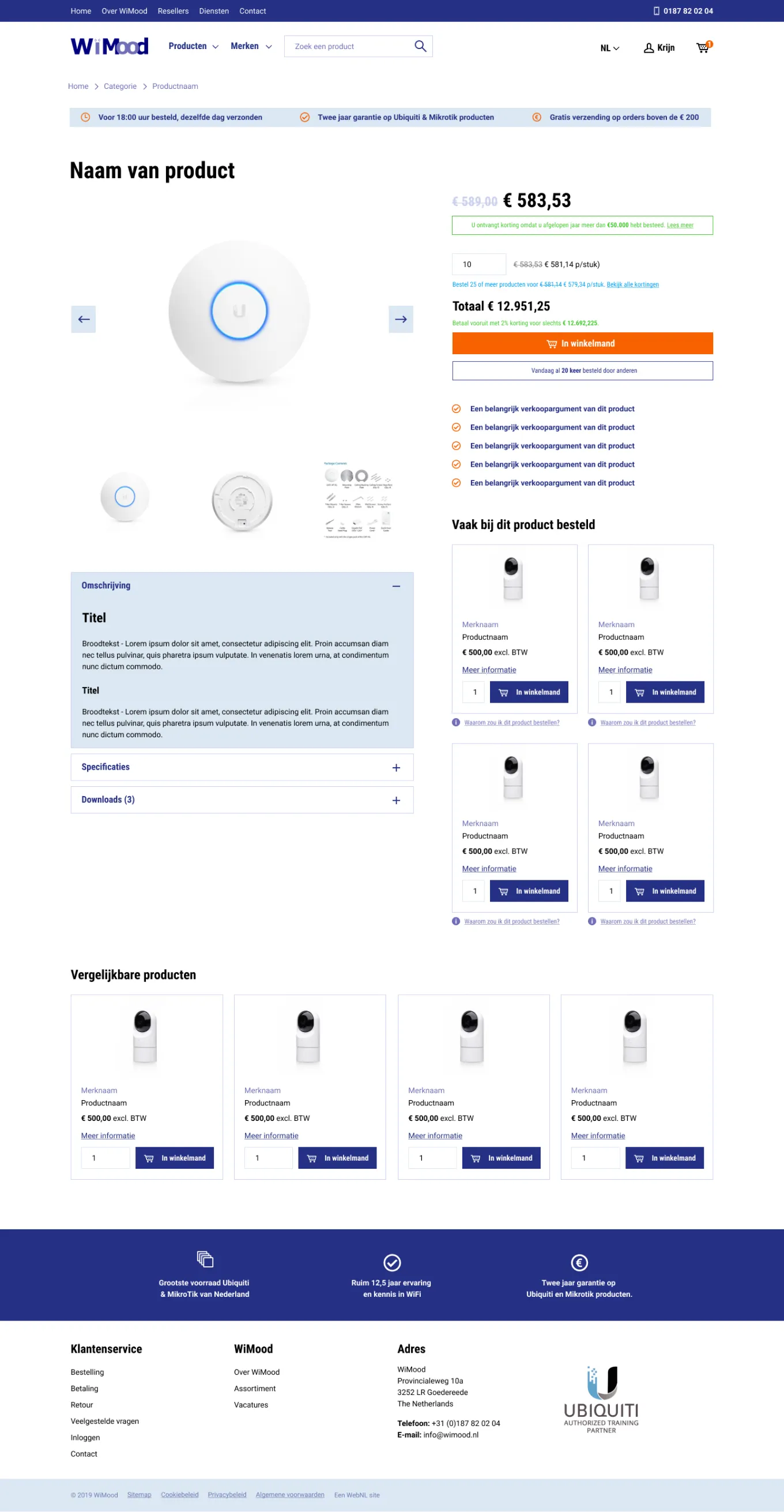
One of the biggest problems in the existing website was the display of discounts and tier prices. Users would often contact our client with questions about these prices. In order to make these prices more clear, I designed a more visually hierarchive way of displaying prices and discounts on the product page.
The client thought this new way of displaying prices was more clear. When the website is launched, they will collect user feedback and experiment with small optimizations to see if users also think these new prices are clear and if this solution can be improved even further.
Handing off frontend templates
During the next two weeks, I was responsible for building the frontend of the application. I used a bare Laravel application to set up a templating system and because the client would be using Laravel for the backend of the application as well. I also implemented Webpack so the client could easily extend the application using modern Javascript solutions.
For the frontend components, I used VueJS, SCSS, BEM naming convention and the Bootstrap 4 grid system. I used these components in templates so they could be tested by the project manager and improved before being delivered to the client. These templates were also presented to the client by me to ensure everything worked.
A Design System Perspective
Some components that had to be made already existed in a library I maintained, and only needed some new styling. Other components had not been made before or weren't up to standards. I spent extra time on these components and added them to my own library so me or other frontenders in our organisation could use them in later projects.
Because of the component system and grid system the client can extend the website easily with new content pages. I showed this functionality to the client in a demo. If there was more time available in the project, I would have liked to also write documentation about this. But because the advanced technical knowledge of our client, documentation this was not a priority.